RGB vs CMYK for Printing — Complete Beginner Guide (2026)
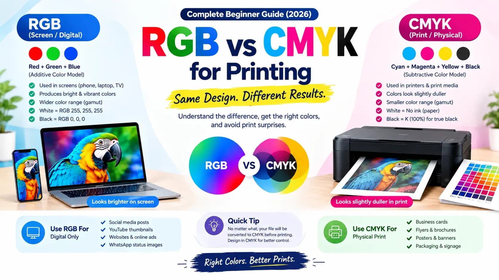
You design a poster. On your screen, the colors look bright, sharp, and exactly right. You send it to the printer, get it back — and it looks dull, flat, and somehow wrong. Nothing was damaged in printing. Nothing was set up incorrectly at the press. What actually happened is that your design was built in one color system and printed in a completely different one.
That's the whole story behind RGB vs CMYK. Once you understand this, you'll never be surprised by a print result again.
Table of Contents
What Is RGB?
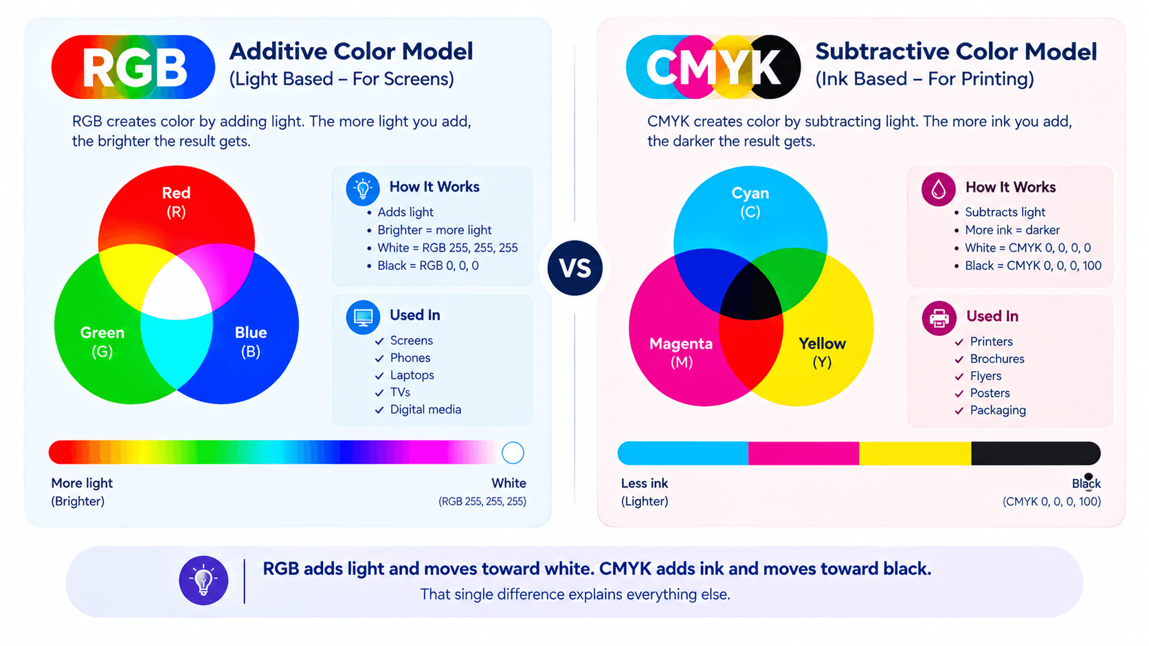
RGB stands for Red, Green, and Blue— and it's the color system used by every screen you own. Your phone, your laptop, your TV. Screens create color by emitting light, which is why RGB is called an additive color model: the more light you add, the brighter the result gets.
At full intensity, all three combine into pure white (RGB 255, 255, 255). With no light at all, you get black (RGB 0, 0, 0). This is exactly why designs look so vivid on screen — they're literally glowing.
What Is CMYK?
CMYK stands for Cyan, Magenta, Yellow, and Key (Black)— the four inks used in almost all commercial printing. Paper doesn't emit light. It only reflects whatever light falls on it, and ink works by absorbing parts of that light.
This makes CMYK a subtractive color model: the more ink you add, the darker the result becomes. With no ink at all (CMYK 0, 0, 0, 0), you simply see white paper. With full black ink (CMYK 0, 0, 0, 100), you get solid black.
You might wonder why black ink is needed at all — in theory, mixing cyan, magenta, and yellow should create black. In practice, it produces a muddy dark brown instead, which is why a dedicated black ink is used in every printing press.
| Property | RGB | CMYK |
|---|---|---|
| Stands For | Red, Green, Blue | Cyan, Magenta, Yellow, Key (Black) |
| Model Type | Additive (light) | Subtractive (ink) |
| Used In | Screens, monitors, phones | Printers, printing presses |
| All Values = 0 | Black (no light) | White (no ink) |
| All Values = Max | White (full light) | Dark brown / black |
| Color Gamut | Wider (more vivid) | Narrower (limited by ink) |
Why Printed Colors Never Exactly Match Your Screen
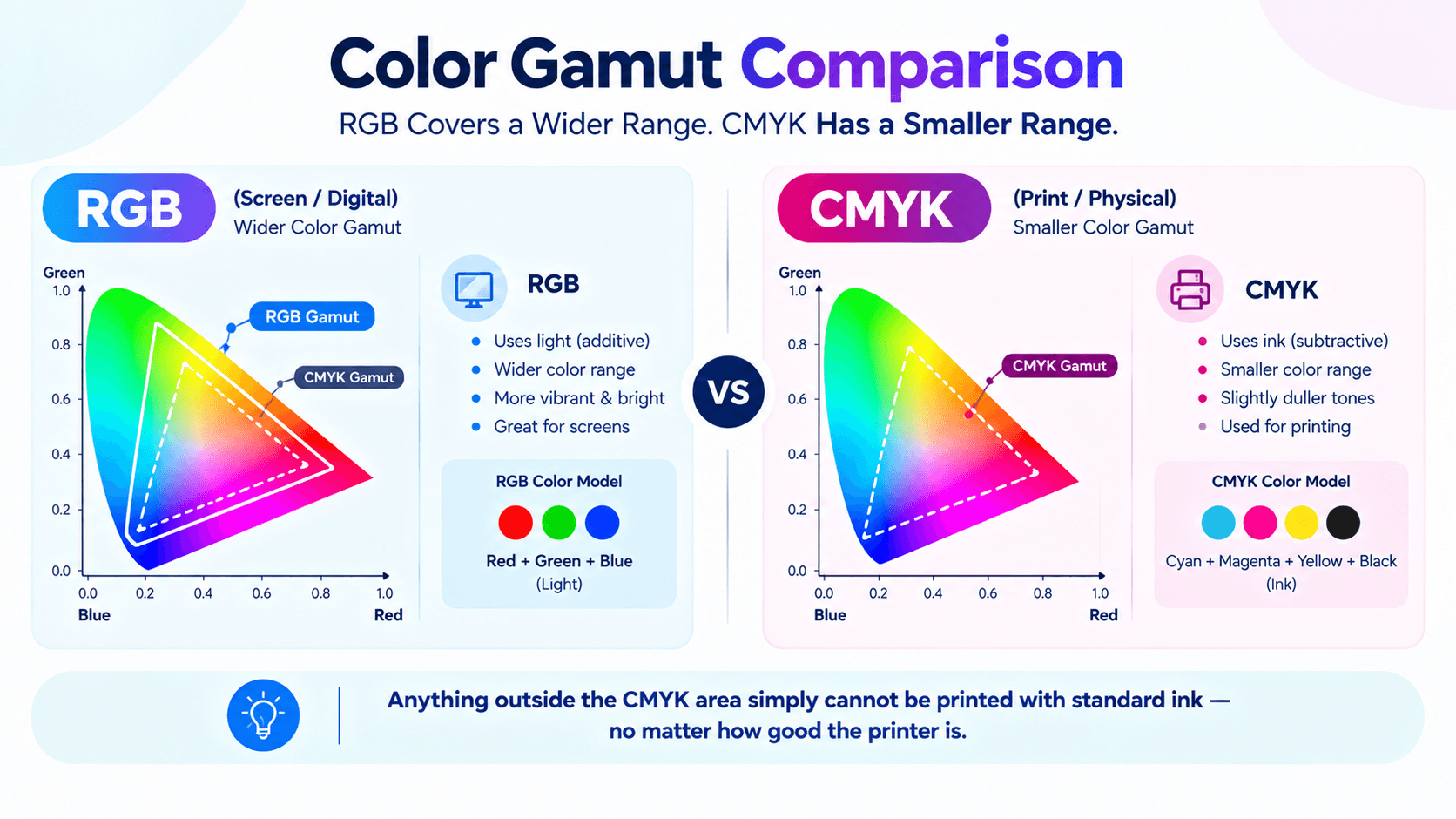
Every color system can only reproduce a certain range of colors, called its gamut. And RGB has a noticeably wider gamut than CMYK.
That means some colors you can see on screen simply cannot be created with printing ink — especially very bright, saturated, or neon shades. When your file gets converted for printing, those out-of-range colors get pushed to the closest printable alternative, which is why they come out looking duller than expected.
This isn't a printing mistake or a low-quality press. It's a physical limit of ink on paper versus light on a screen.
When to Use RGB & CMYK
Use RGB for anything that will only be viewed on a screen — Instagram posts, YouTube thumbnails, WhatsApp status images, websites, and digital ads. RGB gives you the widest, most vibrant color range available for screens.
Use CMYKfor anything that will be physically printed — visiting cards, wedding invitations, festival posters, flex banners, brochures, flyers, packaging, and shop signage. Designing directly in CMYK means what you see while designing is much closer to what you'll actually get back from the press.
Here's the key point most beginners miss: no matter which color mode your file is saved in, it will be converted to CMYK before printing anyway. The only real question is whether you control that conversion yourself— or leave it to the printer's software to decide for you.
| Use Case | Correct Mode |
|---|---|
| Instagram / Facebook posts | RGB |
| YouTube thumbnails | RGB |
| Website graphics & banners | RGB |
| Business / visiting cards | CMYK |
| Wedding invitations | CMYK |
| Flex banners & hoardings | CMYK |
| Brochures & flyers | CMYK |
| Packaging & product labels | CMYK |
Simple Tips to Avoid Print Color Surprises
Set your document to CMYK at the very start of a print project, not after the design is finished — converting later often shifts colors in ways you'll have to fix manually.
Avoid relying on very bright neon shades for print work, since these are the colors most likely to shift noticeably during conversion.
For anything where color accuracy really matters — brand colors, packaging, or a large print run — ask your printer for a test print or hard proof before committing to the full job.
If your brand uses one exact signature color, ask your printer about spot or Pantone colors, which are mixed as dedicated inks rather than built from CMYK combinations.
Common Mistakes to Avoid
- Designing in RGB then converting at the end — always start in CMYK for print projects to keep full control over color shifts.
- Using neon or highly saturated colors for print — these fall outside the CMYK gamut and will always print duller than they look on screen.
- Trusting your screen for final print color approval — request a physical proof from your printer before a full run.
- Ignoring black ink setup — for large solid black areas in print, use rich black (C:60, M:40, Y:40, K:100) instead of plain K:100 to avoid a washed-out look.
Key Takeaways
- RGB is for screens — it uses light and produces brighter, more vivid colors.
- CMYK is for printing — it uses ink and has a narrower color gamut than RGB.
- All files are converted to CMYK before printing. Designing in CMYK from the start gives you control over the result.
- Bright neon colors are the most affected by RGB-to-CMYK conversion — avoid them in print-focused designs.
- Always request a test print or proof when color accuracy matters for the project.
- For brand-critical colors, ask about Pantone spot inks for the most consistent printed result.
Conclusion
RGB and CMYK aren't competing options — they're built for two completely different physical processes. RGB glows with light for screens; CMYK absorbs light with ink on paper. Choose based on where your design will actually end up, set your color mode before you start designing, and ask for a test print whenever color accuracy really matters. Do that, and the gap between your screen and your printed result shrinks to almost nothing.
If you're preparing a design for DTP output — especially in Hindi or Marathi — check the Adobe InDesign Hindi Typing Guide for a complete print workflow reference. And for Shree Lipi users setting up print-ready files, the Shree Lipi in QuarkXPress Guide covers color and font preparation for press output. You can also use the Unicode to Shree Lipi Converter at unicodetoshreelipi.com to convert and prepare text for your print-ready DTP workflow.
Related Guides:
Frequently Asked Questions
Ready to convert? Our main tool handles Unicode ↔ Shree Lipi with the same accuracy and speed — instantly in your browser.
Try Unicode ↔ Shree Lipi Converter